Transforming last-mile experiences with Driver App Solution
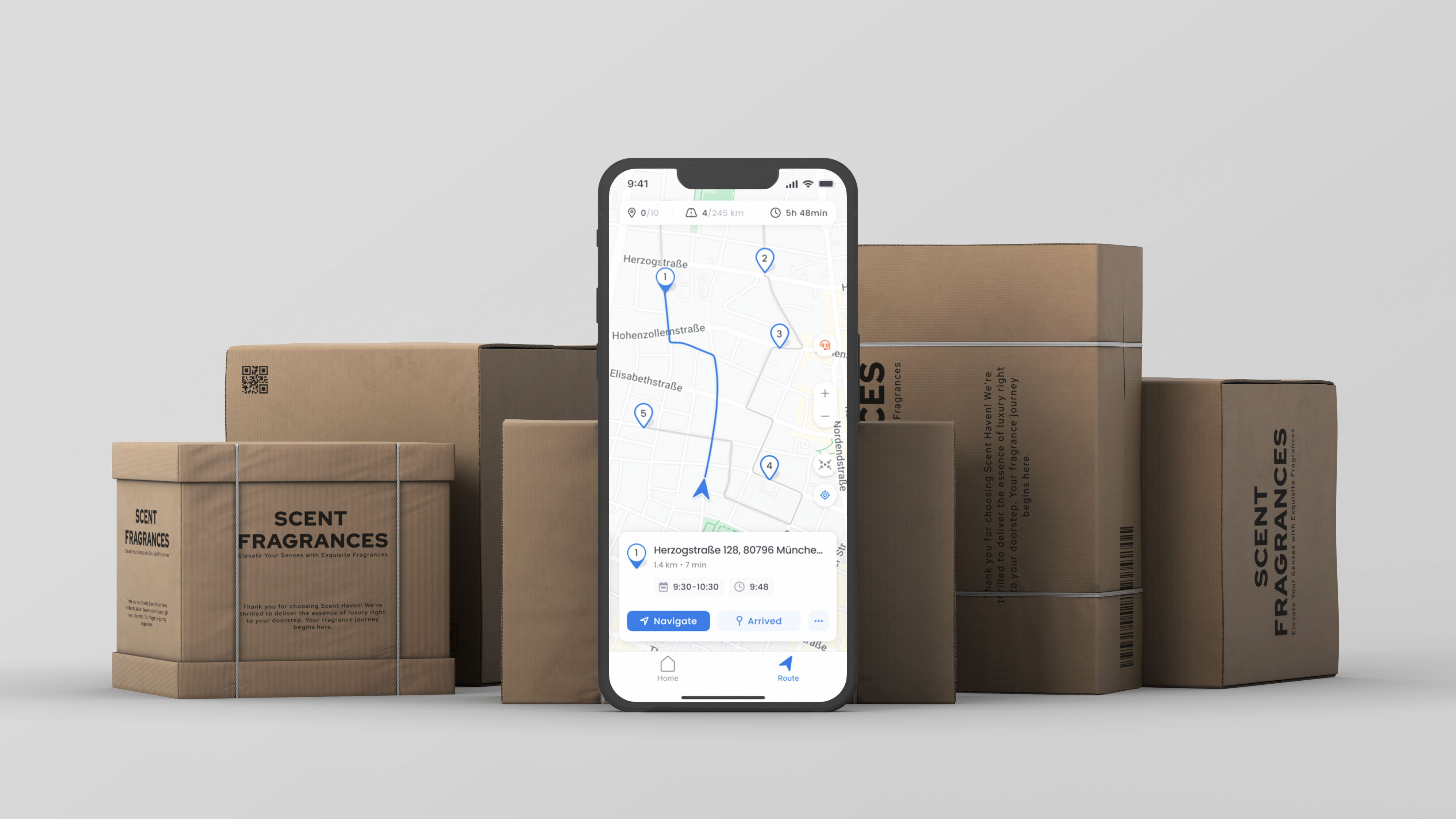
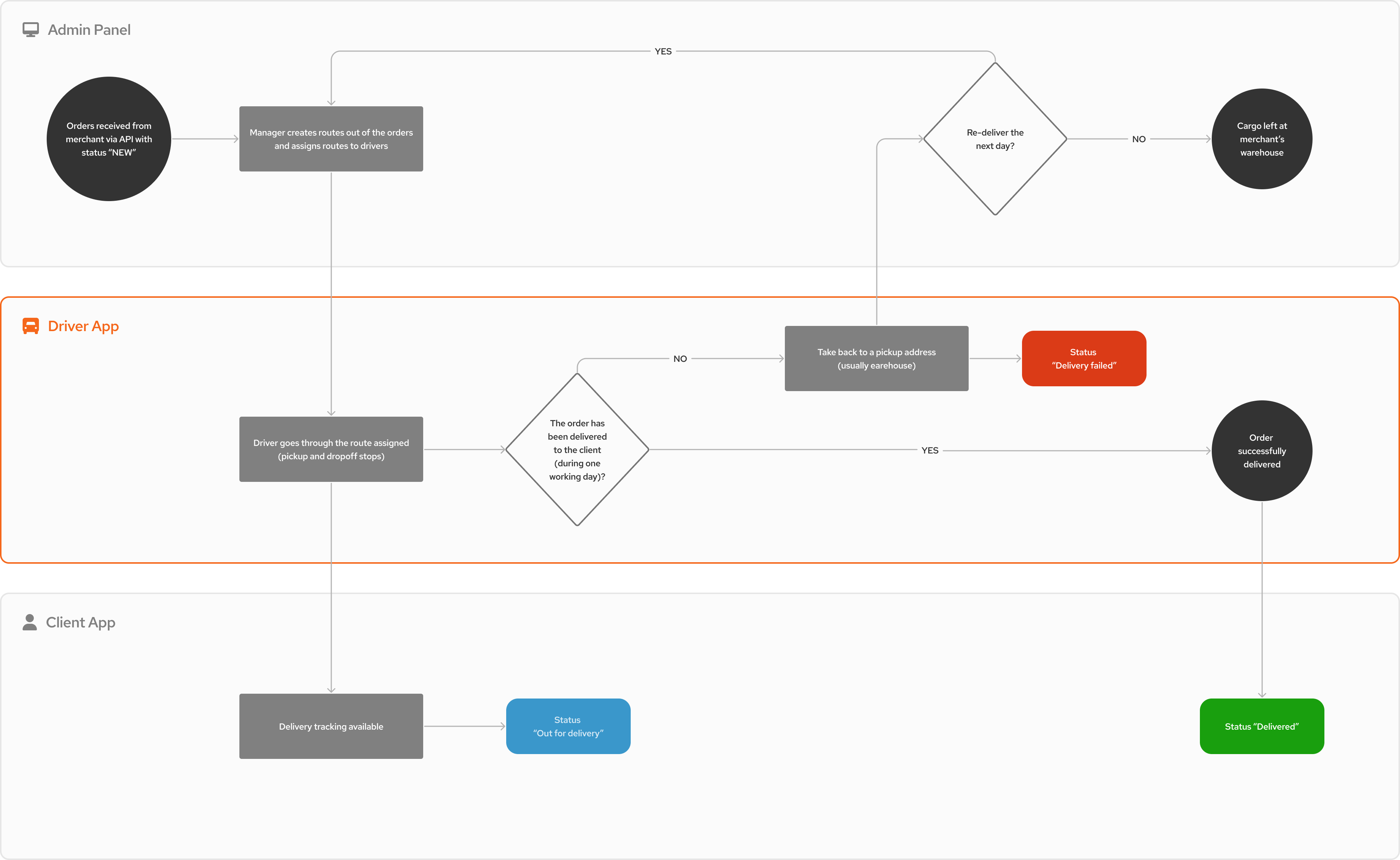
Transforming last-mile delivery with a SaaS solution integrating three applications: Admin Panel Web App, Driver App, and Client App. The company works with small merchants and large retail chains across five countries, specializing in urban delivery. The focus is on seamless experiences for merchants and drivers, and transparent service for consumers.
Delivery drivers prefer simple interfaces with minimal actions. The Driver App, part of the SaaS last-mile delivery solution, manages the final step from distribution center to customer doorstep. Together with the Admin Panel Web App and Client App, it helps drivers efficiently manage routes, access navigation, scan packages, and update customers on deliveries.
As part of the product team under the CEO’s leadership, I improved core user flows, ensured consistent user interface design, and enhanced scalability using a design system. As a product manager, I oversaw the development of both mobile apps and guided the update of the Driver App related API.
- User interviews
- Competitors analysis
- CJMs
- UX flows
- Usability tests
- Wireframing
- Prototyping
- Design system
- Feature analysis, requirements & grooming
- Feature backlog composition
- Iteration feature backlog planning
- Change request management
- Internal feature dependency tracking
The Driver App is a vital component of the B2B SaaS delivery solution. However, driver resistance and sabotage have emerged as significant issues, as drivers perceive the app as a means of control and extra workload rather than a useful tool.
Our service execution team found that about 30% of onboarded drivers refused to use the app, claiming it “doesn’t work.” However, our data shows that these drivers opened the app 2-5 times before resorting to a printed list of addresses.
This resistance is detrimental to the entire system as the Driver App is essential for updating delivery statuses. Its underutilization disrupts workload optimization and process transparency, leading to inefficiencies. Consequently, this disruption has led to a delay rate exceeding 70%.

Optimize delivery flow decreasing the actions required from the driver, leading the driver through the delivery process and boosting the overall experience associated with the SaaS delivery solution.
- Reduction of the clicks required to complete “one pickup - one dropoff” flow by 30%
- Increase adoption rate to 80%
- Decrease delay rate to 20%
Willing to understand the full scope of the difficulties drivers face during the delivery process, I took charge of a thorough research process:
- I created a complete interview guide and adjusted it for service execution team to conduct interviews with drivers during the onboarding and support processes.
- Collaborating with the service execution team, I gathered profound insights from drivers interviews.
- I prepared and conducted naturalistic users observation with 7 drivers to better understand the driver’s interaction with the phone during the ride and pickup/delivery stages and challenges arising.
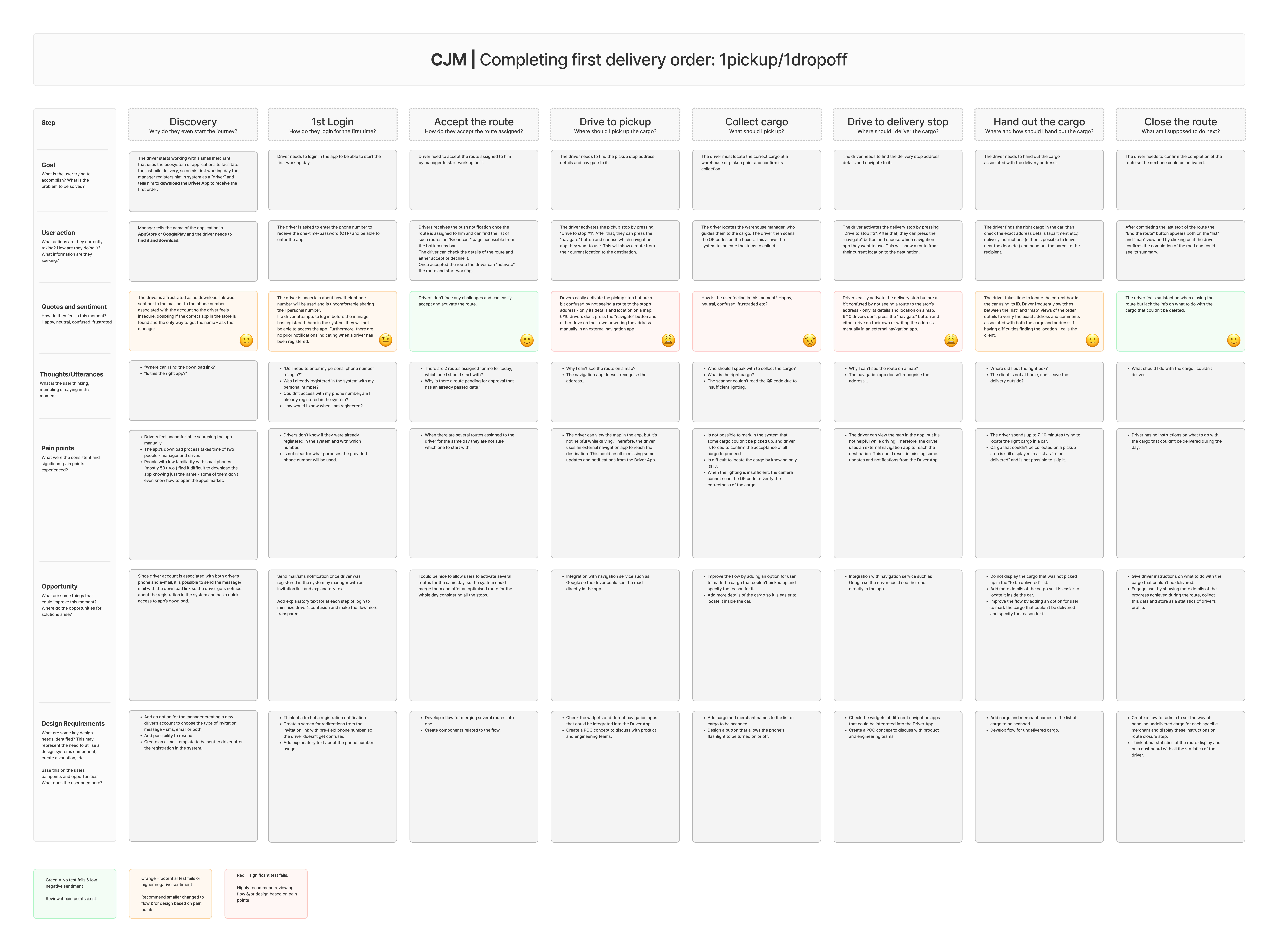
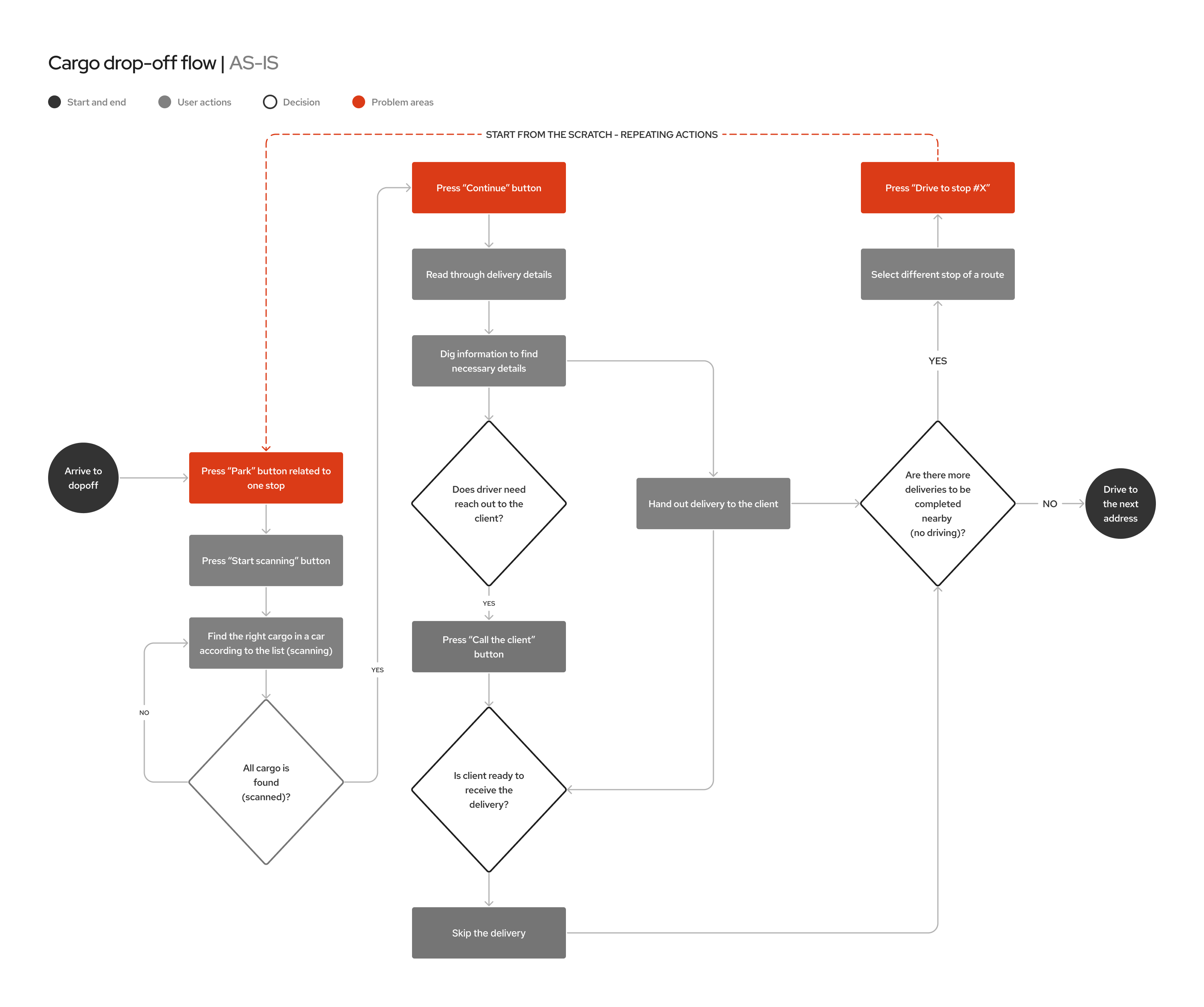
Analyzing collected data, I crafted user journey maps for various scenarios, pinpointing key pain points:
- Cargo loading:
- Driver receives multiple parcels without delivery order information and no suggestions on how to arrange boxes in a car;
- Results in 5 to 15 minutes spent searching for the right parcel during drop-offs.
- Erroneous status assignment:
- Difficulty finding a “skip” option when a delivery can’t be completed;
- Incorrectly pressing “Confirm delivery” leads to wrong updates, hindering re-delivery.
- Address details consistency:
- Drivers struggle to locate necessary address details, taking up to 5 minutes;
- Frequent switching between ’list’ and ‘map’ views disrupts efficiency during navigation.
- Multiple deliveries flow:
- Handling cargo for multiple orders with close addresses lacks optimization;
- Streamlining this process could reduce excessive clicks and enhance efficiency.
- Incorporating explanatory text into the login flow and providing access to support can decrease driver confusion, eliminating the need for managerial help during onboarding.
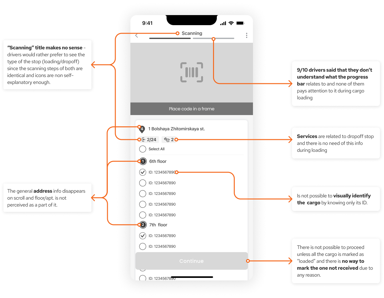
- Including merchant and cargo names during the “loading” and “drop-off” steps could speed up the process of locating specific cargo in the warehouse and the vehicle.
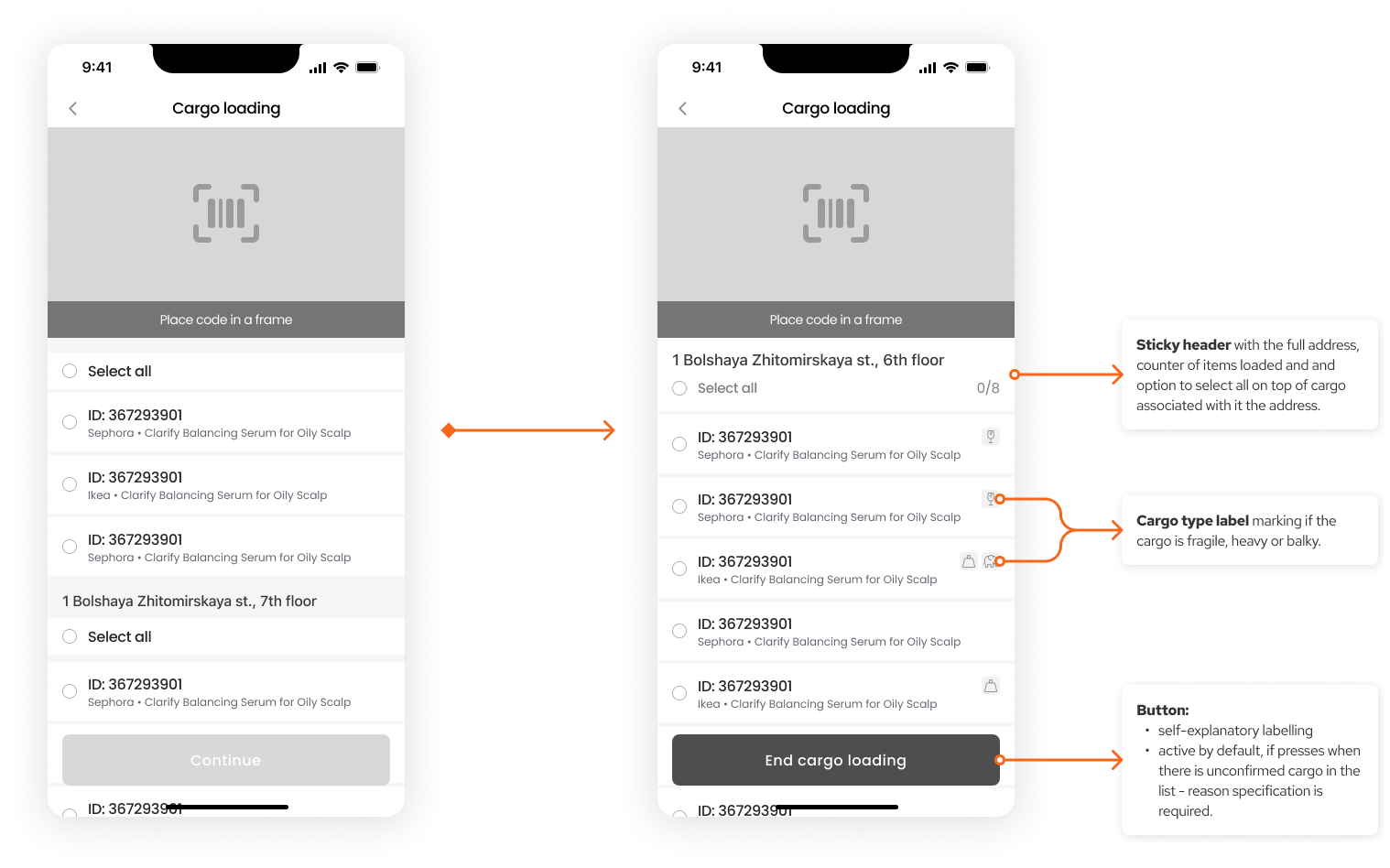
- Displaying the full addresses on the top of the cargo related to it on “loading” and “drop-off” steps could speed up the process of locating specific cargo in the warehouse and grouping it for delivery at drop-off.
- Including cargo images during the “loading” and “drop-off” steps could expedite the process of locating a specific cargo in the warehouse and the vehicle.
- Labeling the types of stops with text rather than icons could decrease the time spent at each stop.
- Assisting the driver in arranging parcels in the car according to the delivery order can cut down the time spent on each drop-off, and reduce the delay rate.
- Positioning “Skip pickup/delivery” on the first level could decrease the instances of pressing “Confirm delivery” when the step hasn’t been executed.
- Optimizing the pickup-delivery flow by reducing the number of screens and requiring fewer actions can increase the adoption rate.
- Other Local Delivery Services: Companies in the same geographic area offering similar delivery services - AmoOnfleet, Urbantz, Milkman Technology, Kardinal, and Gordon;
- Courier Services: Established courier services that handle parcel deliveries - FedEx, UPS, DHL;
- Logistics Companies: Larger companies specializing in logistics and transportation services.
- Ride-Sharing Services: Platforms that offer rides but may also provide delivery services;
- Tech Platforms with Delivery Services: Companies like UberEats or DoorDash, which focus on food delivery but may expand to other goods;
- Traditional Postal Services: National or regional postal services that handle package deliveries;
- E-commerce marketplaces: large e-commerce companies such as Amazon, Alibaba, or Walmart develop their in-house last-mile delivery networks to fulfill their orders;
- Logistics and supply chain management software providers: offering broader logistics management software, like Descartes Systems Group or BluJay.
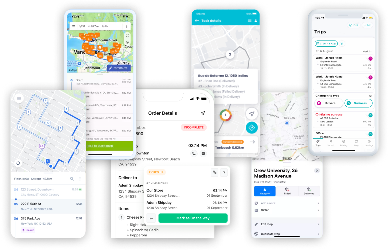
I led brainstorming sessions with the product and customer service teams, leveraging research findings to generate ideas for resolving driver issues within the app. Subsequently, I consolidated these ideas into potential solutions, each targeting a distinct problem:
- “Loading” step redesign - I detected numerous issues related to the pickup process during user testing. So, I proposed testing related hypotheses to make the screen clearer and more beneficial for drivers.
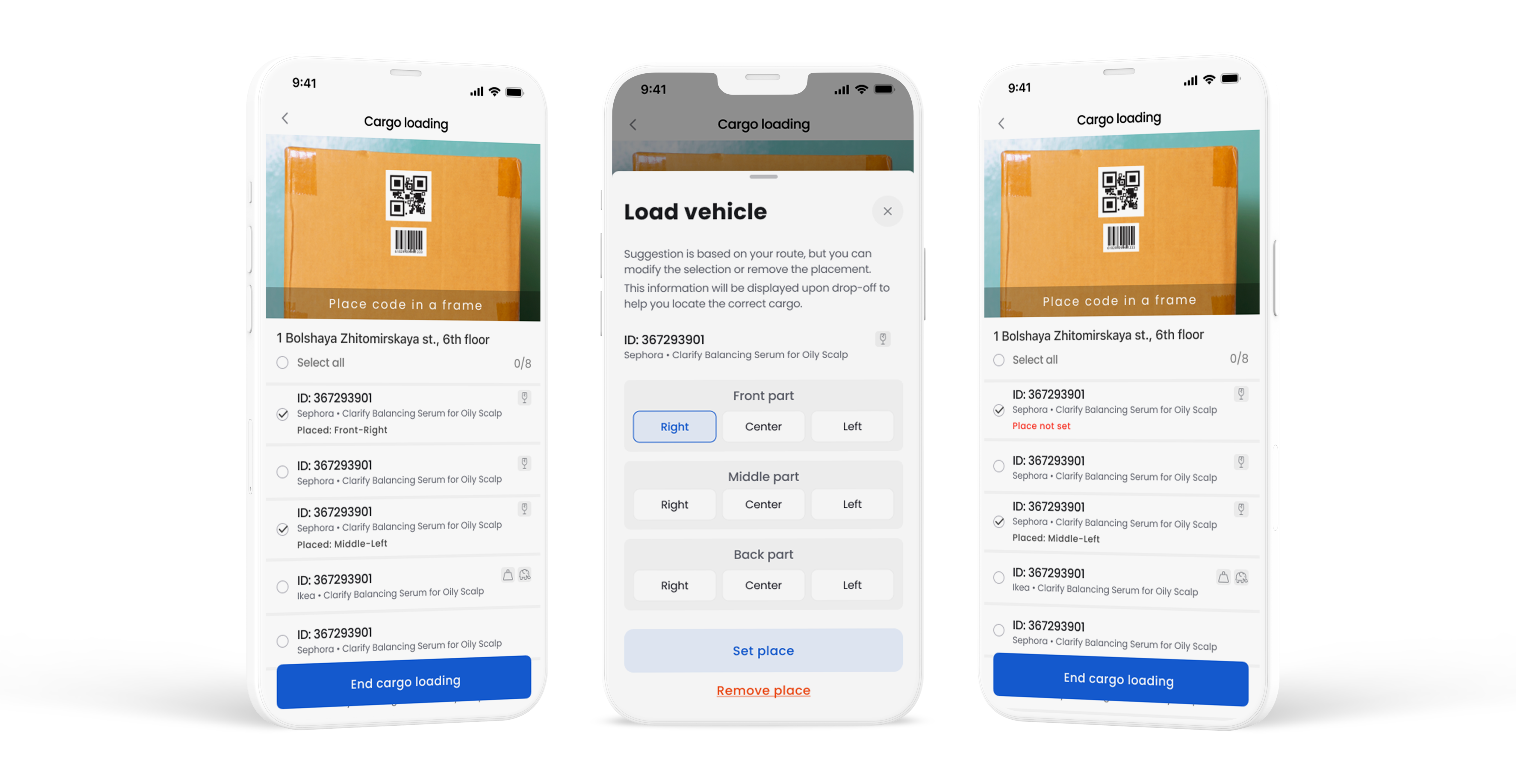
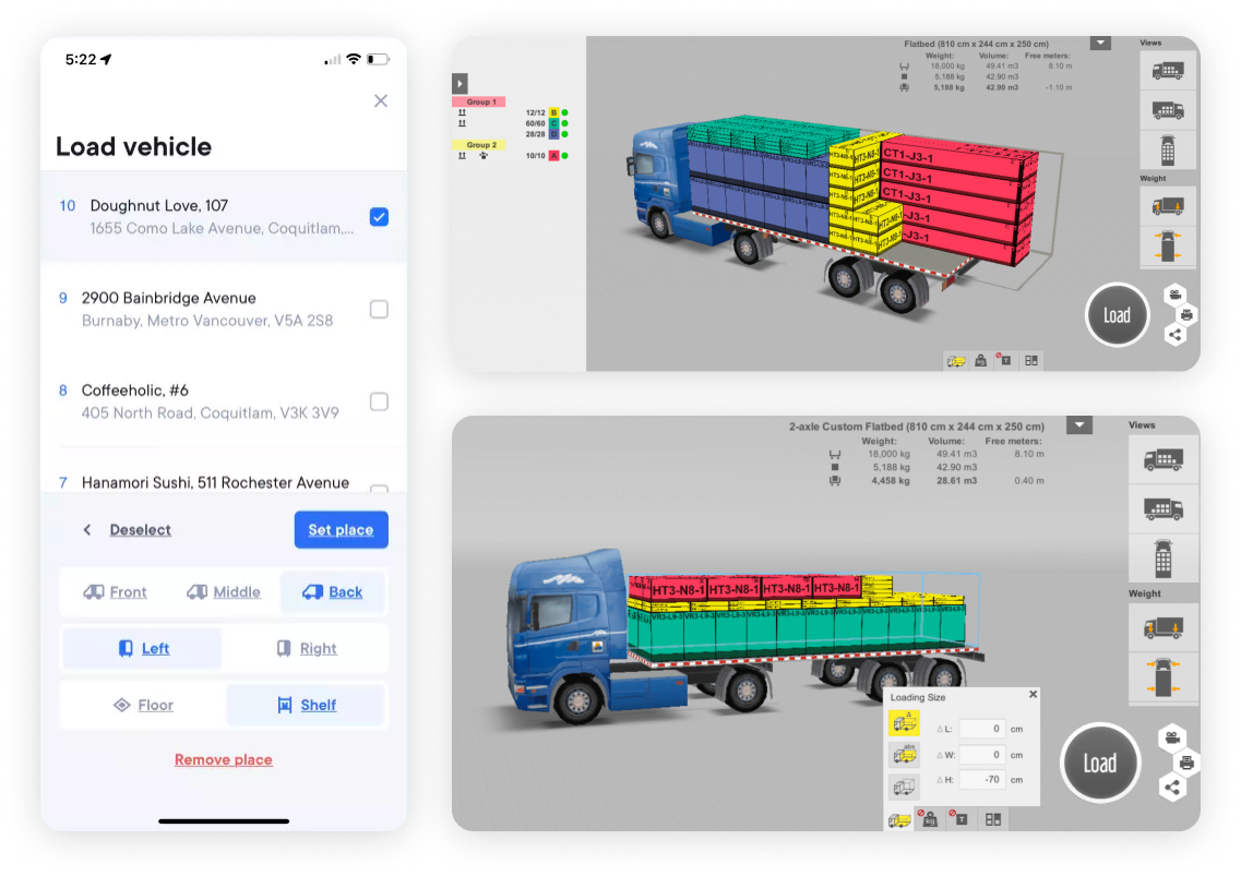
- “Smart loading” - I proposed implementing a feature that helps drivers organize parcels in their cars according to the delivery order. This feature would suggest the best placement inside the car and provide this information to the driver at the drop-off location. While only a few competitors have this feature, it could be a key aspect in reducing drop-off time and minimizing physical actions required from the driver.
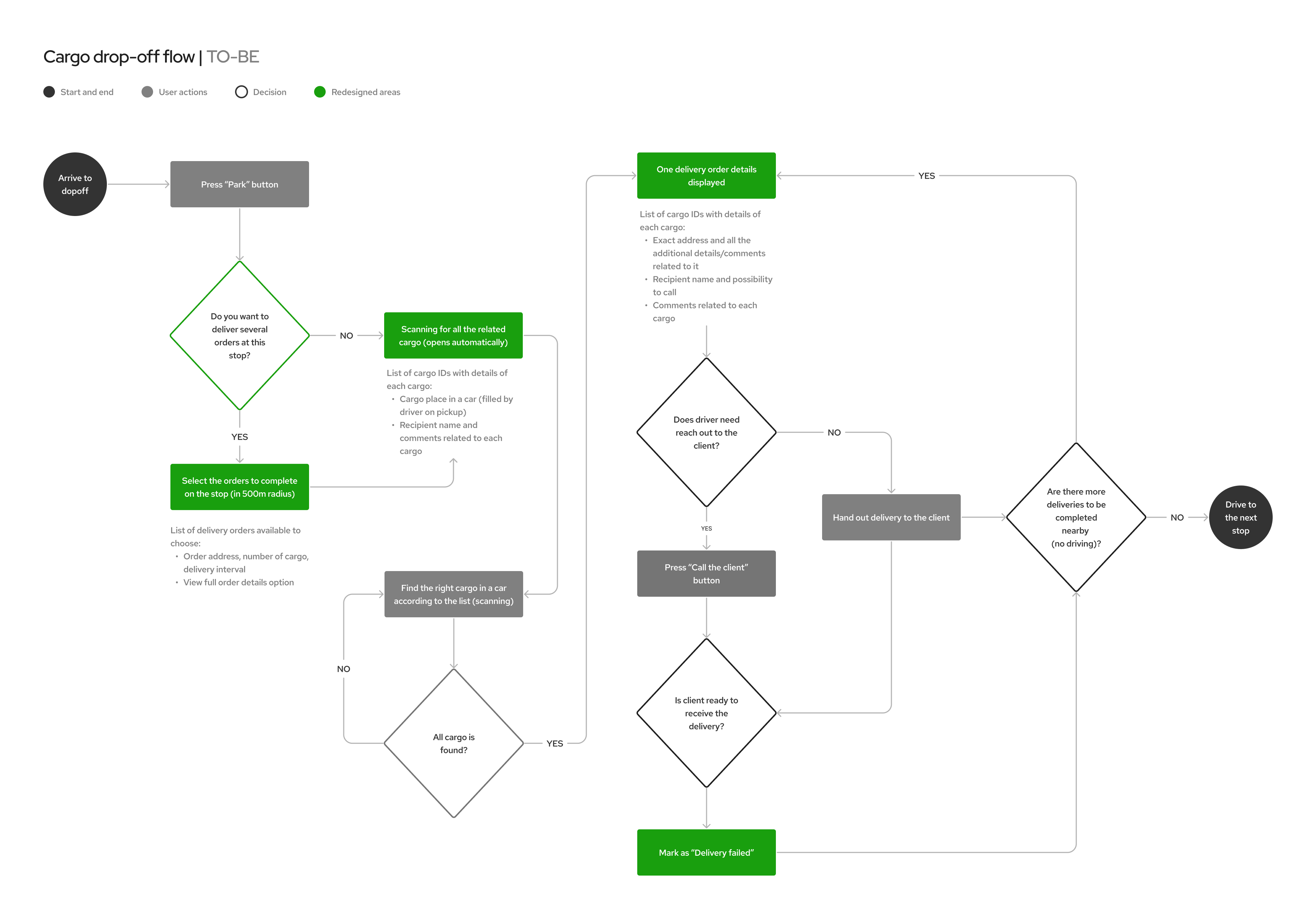
- Optimize the flow for multiple deliveries at one (or close) address when no driving is required to proceed with the following delivery order handout.
- During the competitor analysis, I noted that the highest-rated driver apps use a single screen for both “map” and “list” views. This observation boosted my confidence in a related hypothesis I had developed during user testing, so we decided to test it.
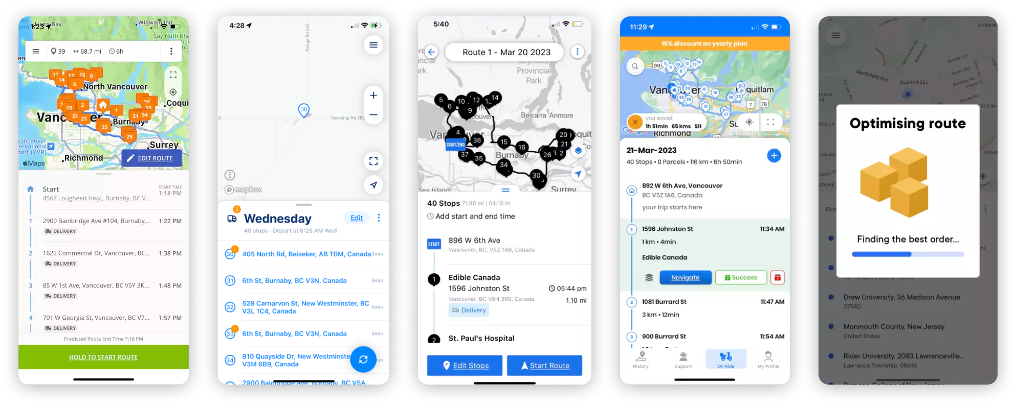
After gathering ideation insights, I created low-fidelity wireframes. Due to technical constraints, we couldn’t conduct A/B testing or execute a beta launch. Hence, the results were validated with the team and some drivers within the company.
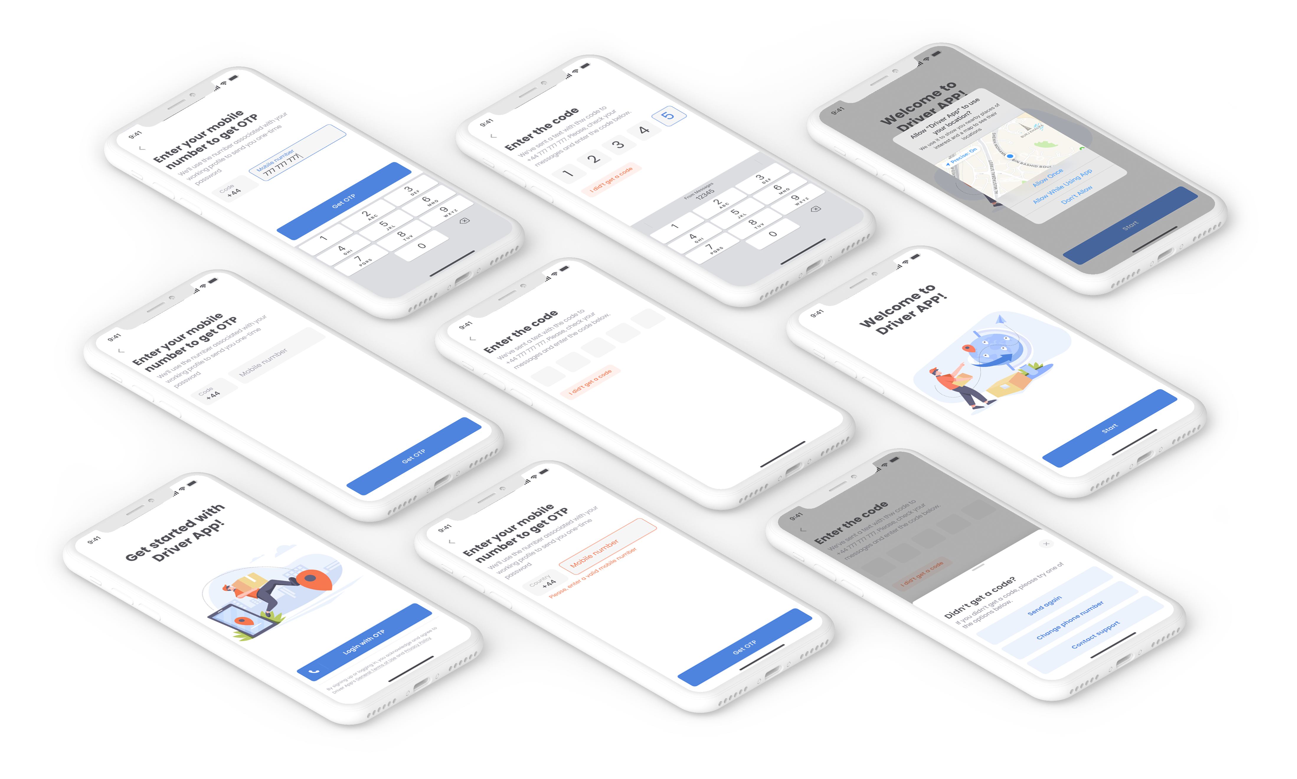
The One-Time Password (OTP) flow is already implemented and is a swift method for user login or signup. Therefore, it didn’t require any changes, just proposed a few enhancements:
- Add explanatory text for each step to guide users;
- Include a “Change Phone Number” button to allow users to easily return to the phone input field;
- Incorporate a “Contact Support” button to enable users to connect with the service execution team;
- Consolidate all issue-related buttons into a bottom drawer, accessible by tapping the “I didn’t receive a code” button, to keep the screen clean and simple;
- Incorporate the “Allow to use device’s location” request into the login/sign-up process. This is essential for initiating work and ensures drivers won’t be obstructed later when it’s time to accept a route.
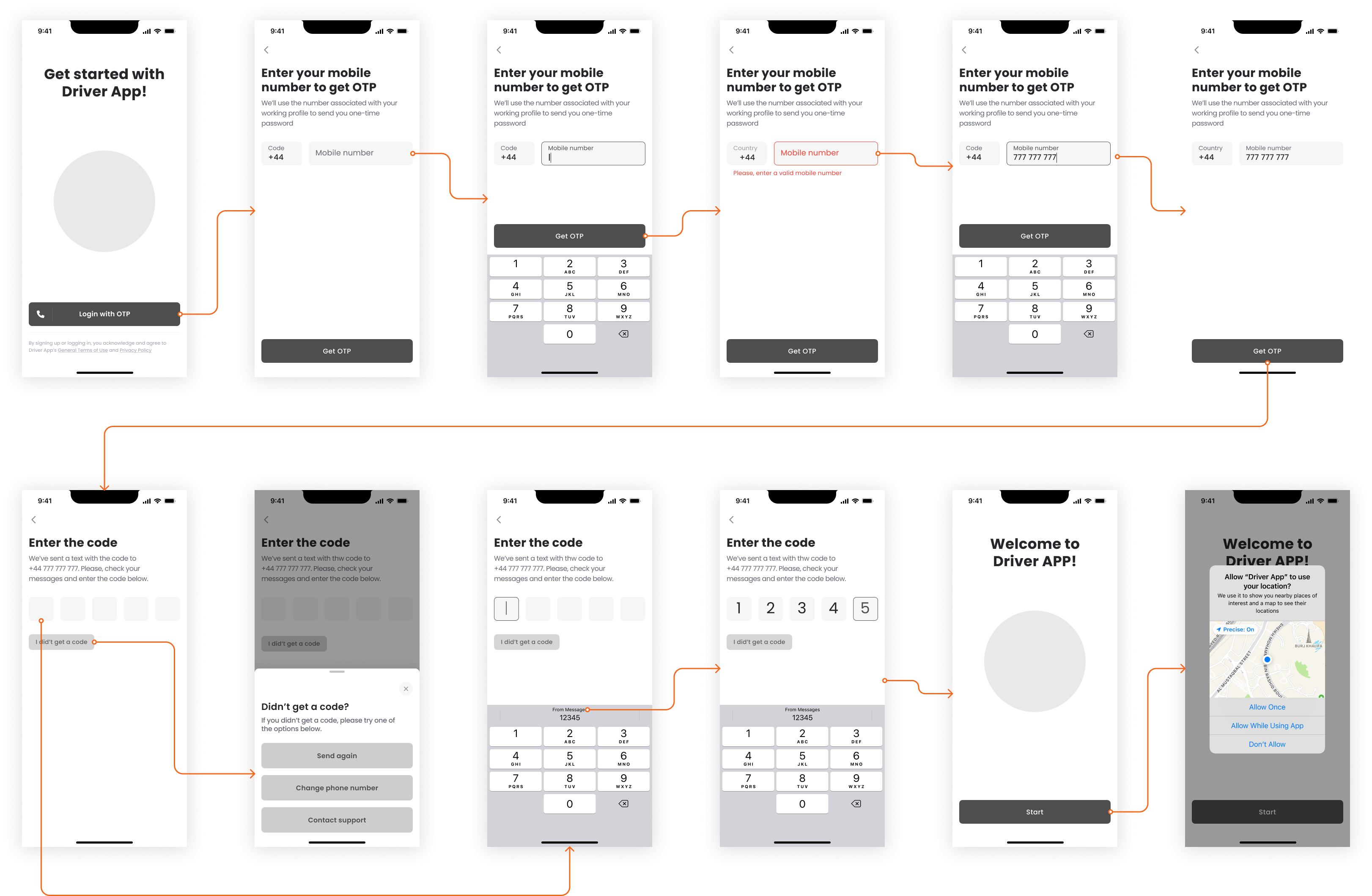
Both the product and operational teams approved the proposition. The engineering team was able to plan the implementation for the upcoming sprint, given that only input from the mobile team was required and there was sufficient capacity.
Hypothesis 2: Including merchant and cargo names during the “loading” and “drop-off” steps could speed up the process of locating specific cargo in the warehouse and the vehicle.
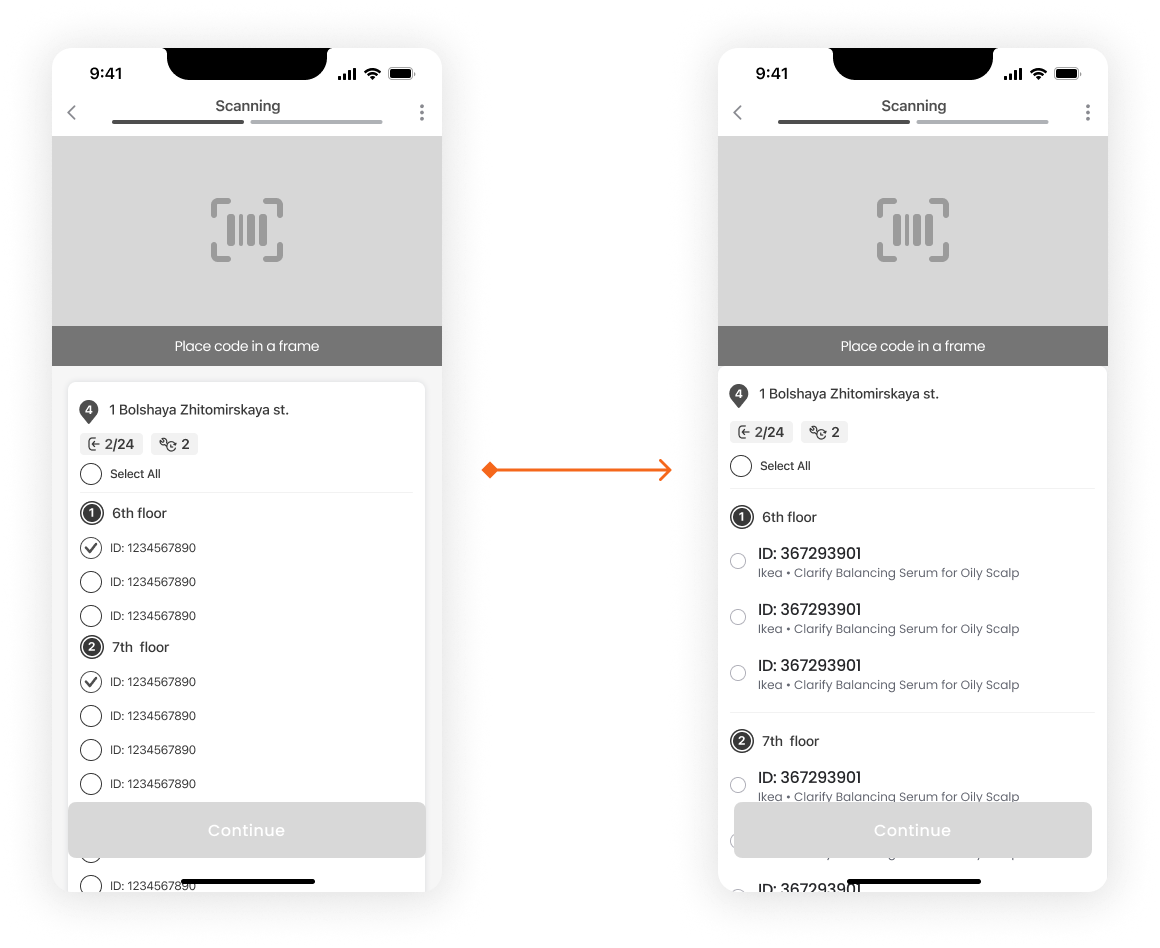
While updating a screen, I decluttered it by removing the secondary background and shading of an informational block, and standardized the margins throughout.
Hypothesis 3: Displaying the full addresses on the top of the cargo related to it on “loading” and “drop-off” steps could speed up the process of locating specific cargo in the warehouse and grouping it for delivery at drop-off.
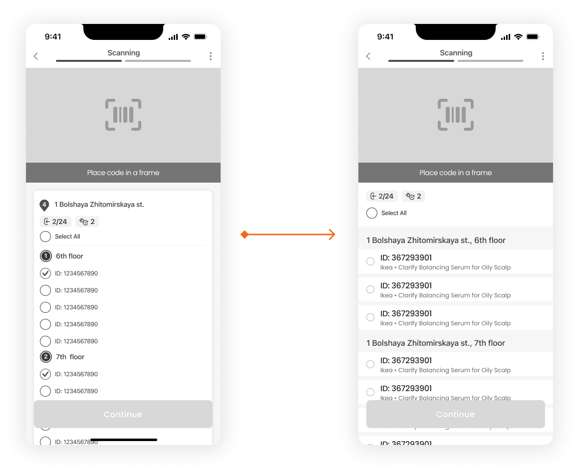
I suggested placing the address above the corresponding cargo and eliminating the numerical number, as no use case for it was found. I presented the updated screen to the drivers, and they accepted the change.
Hypothesis 4: Including cargo images during the “loading” and “drop-off” steps could expedite the process of locating a specific cargo in the warehouse and the vehicle.
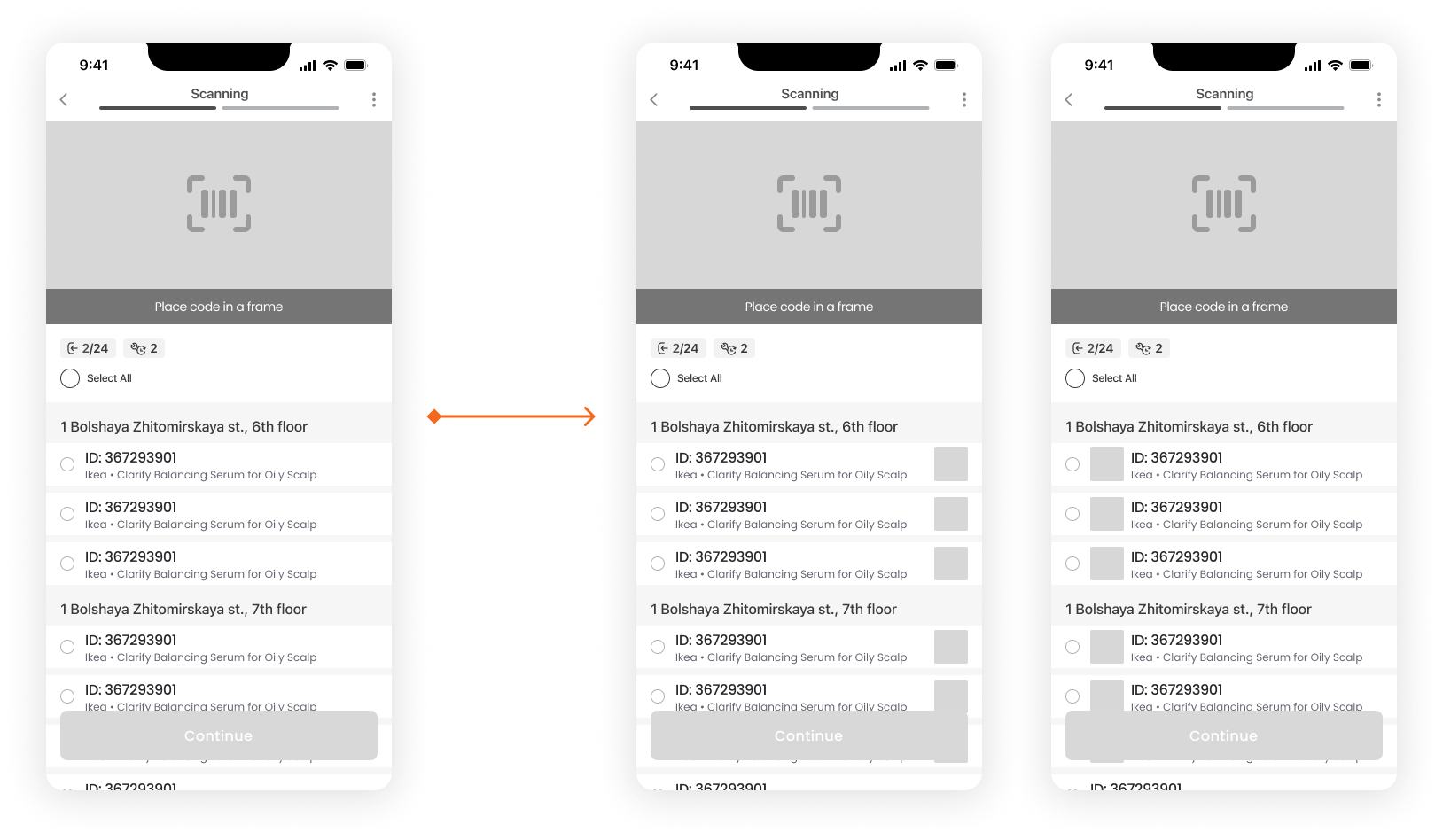
The hypothesis was dismissed by both myself and the operational team. We found the screen overly saturated with images, and it didn’t make much sense. Specifically, it was impossible to correlate the image of an item with its box.
Hypothesis 5: Labeling the types of stops with text rather than icons could decrease the time spent at each stop.
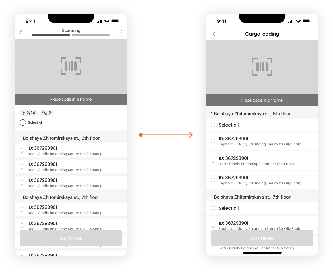
I tested variations of the screen with the drivers to distinguish between loading and delivery steps. All eight drivers responded faster to the new version. The simplified screen gained approval from both the product team and drivers, leading to its adoption. Additionally, I recommended adding a “Select all” option for individual addresses to enhance flexibility.
After testing and evaluating all the hypotheses, I chose to dedicate another sprint to refining the loading screen’s UI. I also started considering potential enhancements and how they might be later incorporated into the updated screen.
Beyond the generated hypotheses, I proposed adding labels for specific cargo types like “fragile”, “bulky”, and “heavy”. This way, the driver can understand basic characteristics of the cargo when trying to locate and load it into the car.
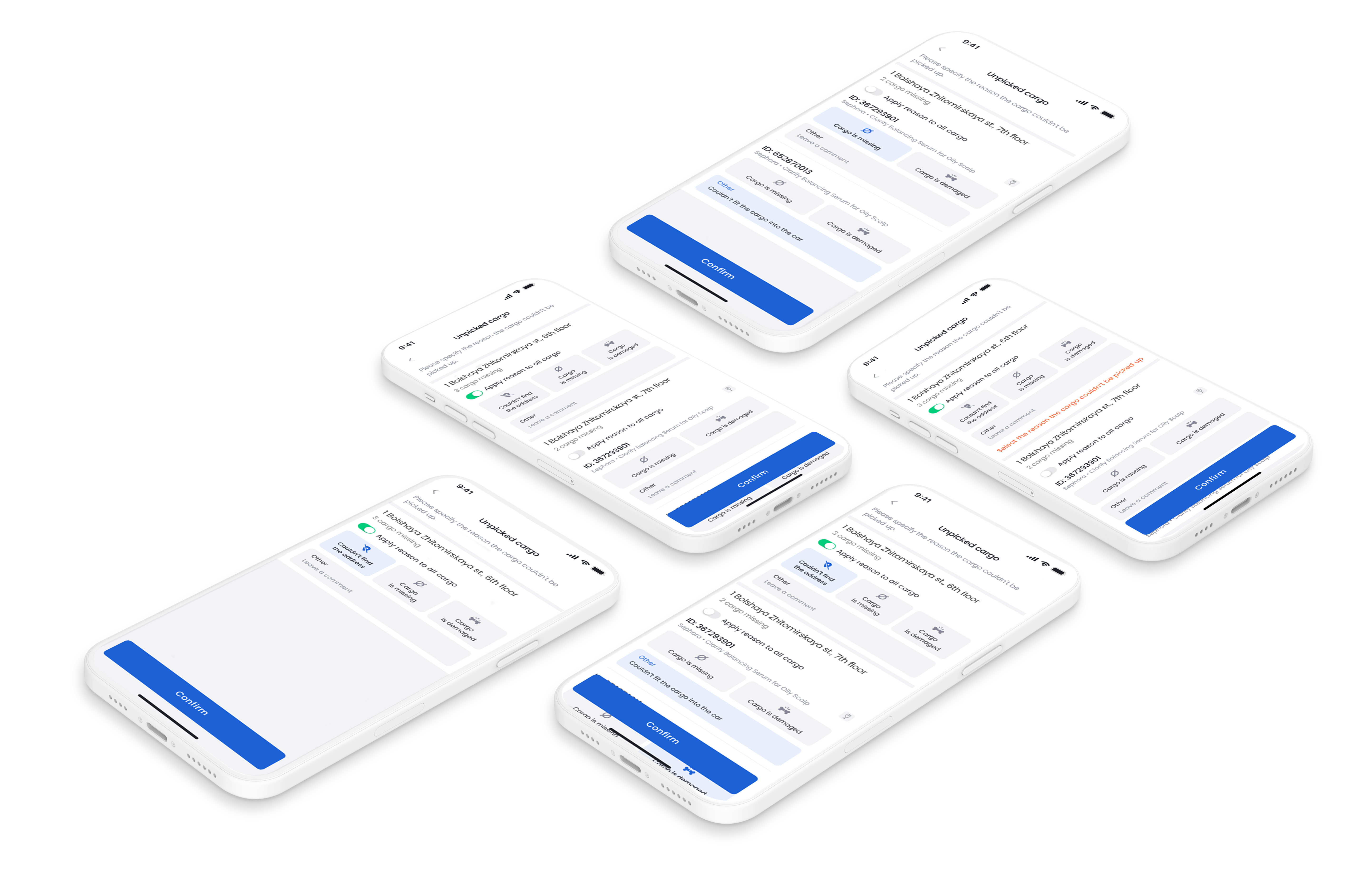
Regarding the issues of lost cargo, I’ve developed a process for uncollected cargo. My proposal involves asking the driver to specify a reason why the cargo couldn’t be picked up. This can be applied to all cargo associated with a specific address or to each cargo if reasons vary.
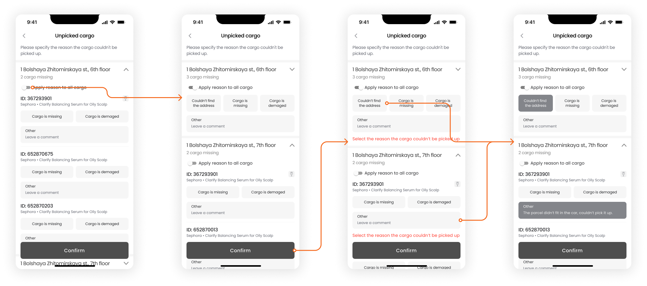
I aimed to create large buttons to help drivers easily select the correct reason. After receiving user feedback, I also decided to enhance these buttons with icons during the high-fidelity design stage.
Hypothesis 6: Assisting the driver in arranging parcels in the car according to the delivery order can cut down the time spent on each drop-off, and reduce the delay rate.
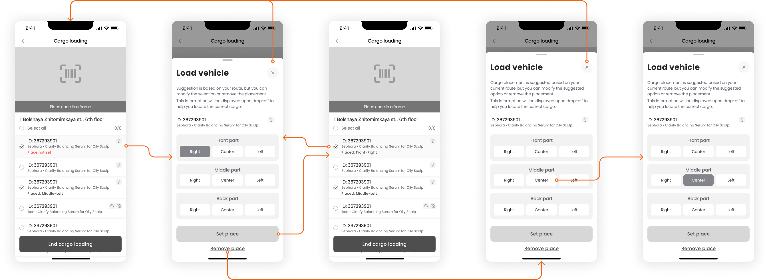
Although the parcel placement specification is optional, we want drivers to consider it. The parcel location at the drop-off stop significantly affects the time spent and consequently, the delay rate.
To simplify the process for the driver, I propose the following flow:
- When the cargo is scanned at pickup, it is marked as “received”.
- The “Load vehicle” drawer, with a pre-selected suggested placement, opens automatically.
- The driver can either confirm this suggested placement, modify it, or remove it entirely.
- If a placement is set, it will be displayed at the drop-off stop of the corresponding order.
The product and operation teams have approved the concept and I took it to the hi-fi step, but the drivers have not reached a consensus on this feature.
Hypothesis 7: Positioning “Skip pickup/delivery” on the first level could decrease the instances of pressing “Confirm delivery” when the step hasn’t been executed.
Hypothesis 8: Optimizing the pickup-delivery flow by reducing the number of screens and requiring fewer actions can increase the adoption rate.
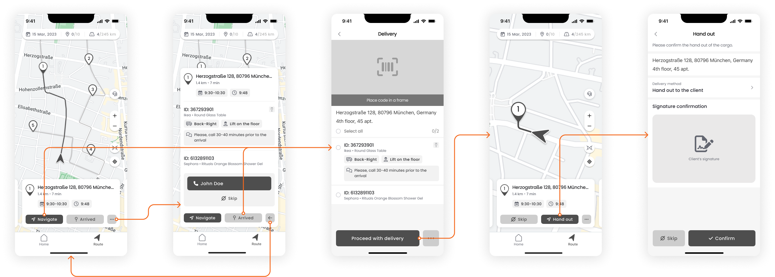
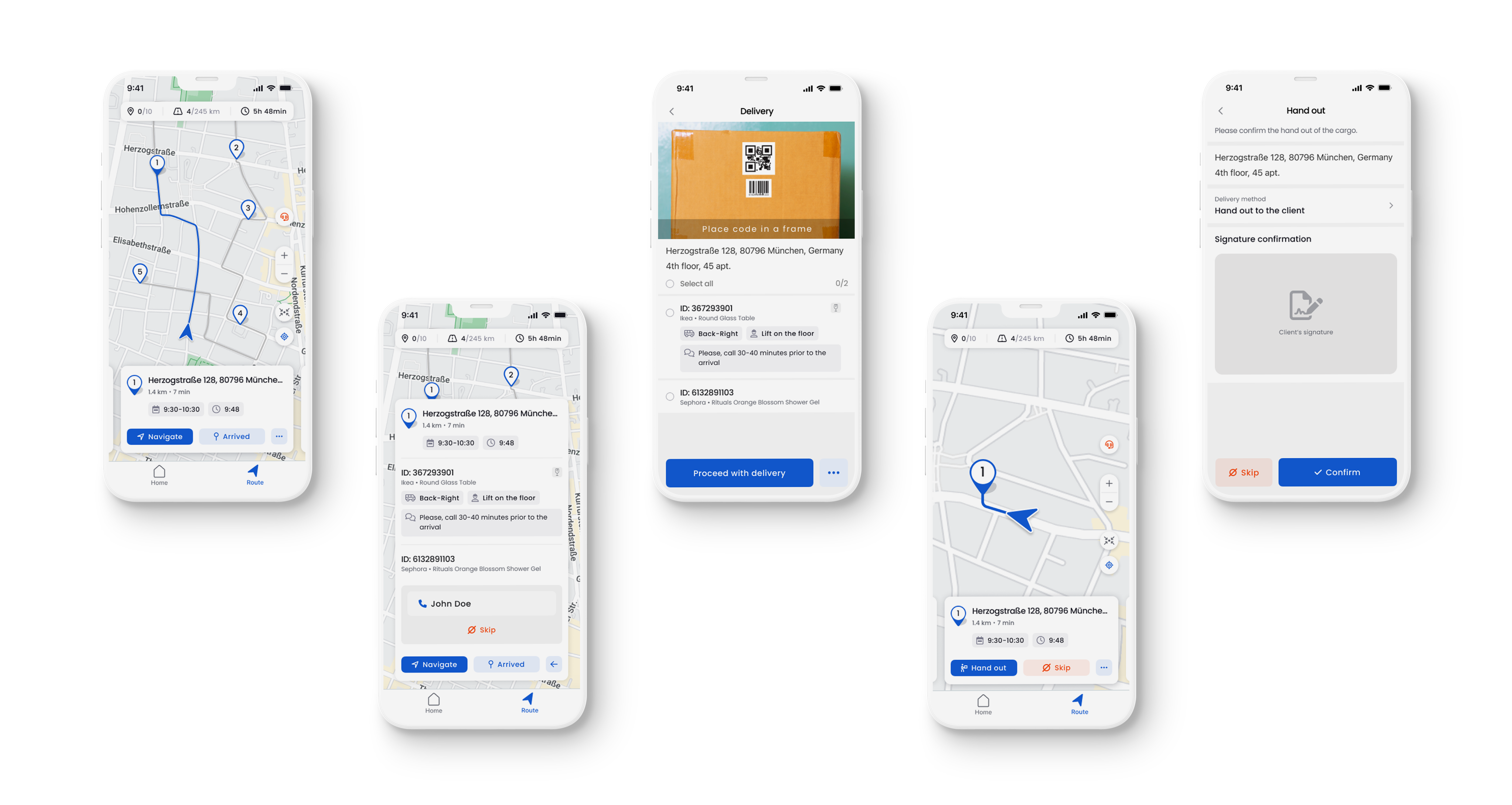
The “list” and “map” views have been combined into one, allowing drivers to switch between stops by either selecting them on the map or scrolling through the blocks at the bottom of the screen.
After several iterations and tests of the new route screen, I arrived at the following concept:
- Numerically show the progress of the route, replacing the progress bar;
- Provide quick access to the help center, which was previously only on the home page;
- Display scrollable blocks related to each stop for intuitive switching.
I also modified the scanning step to display all the information filled in by the driver upon pickup. Additionally, I moved the “Skip” button to the first layer on the “hand out” step to reduce incorrect status assignments.
At the project’s start, no design files existed, as the tool was fully coded. Initially, I hesitated to invest time in building a design system, fearing it might prolong the project. However, recognizing its significance in terms of development efficiency, UI consistency, and future scalability, I opted to adapt the native iOS and Android design systems for each platform, making quick modifications to align it with the product requirements, and thankfully, the outcome was a success.
I’m proud to share the results we could achieve with the team in 1.5 years of work:
- Achieved a reduction in the clicks required to complete the “one pickup - one dropoff” flow.
- Achieved the goal of increasing the app’s quarterly adoption rate to 82%.
- Decreased delivery delays rate from 70% to 34% with an initial target of 30%.
- The implementation of “smart loading” and — features helped to close 3 big B2B client.
During this project, I was in charge of product research and could gain insights from both design and product management perspectives.
The most challenging issues were:
- Interviewing people with quite low digital familiarity, creating and testing hypotheses to improve experience with no access to A/B testing or beta launches;
- Managing backlog priorities for multiple clients requiring various features within tight timeframes;
- Planning the backlog for Product Iteration (PI), considering the capacity and dependencies of different teams (Front-End, Back-End, Mobile), taking into account the constant changelog from the product side.
This experience was quite different from my previous design roles, as I not only faced design challenges but also delved into technical aspects. This helped me understand the interrelationships among the apps and their entities and write clear and feasible feature requirements for the engineering team, supported by high-fidelity wireframes.
